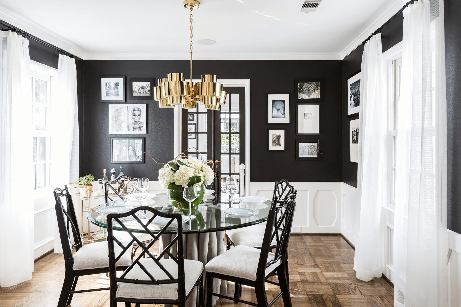
Any designer will tell you there’s an art — a science even — to arranging the perfect space. But that doesn’t mean those same designers won’t occasionally thumb their noses at “the rules,” those sacrosanct musts that too often get all the credit for a great room.
“I love a good rule,” says Justin Riordan, interior designer. “It tells me how far I should go, what I should and shouldn’t do, and when I should just say, ‘Screw it!’ and break that rule because all rules are stupid.”
Yes, good design might just lie in the balance of knowing when to obey the rules — and when to run roughshod over them. Want to be a skilled rule breaker? Get ready to revolt, you rebel. These interior design rules are just begging to be broken:
1. Artwork should always be hung at eye level
OK, sure, there’s a functional basis for this one. But if all the art in your room is eye level, things can end up looking really ridiculous really fast — particularly when it comes to groupings and gallery walls.
In reality, this is a rule best suited to rooms with 8- or 9-foot ceilings, and for art that’s not much taller than 30 inches or so, says Bethany Adams, an interior designer in Louisville, KY.
But if you have higher ceilings and bigger art, obeying this rule can create the illusion that “your art is slumping toward the floor or about to crush whatever furniture you’ve placed beneath it,” Adams says.
Instead, for optimal visual appeal, Adams recommends mentally separating the wall into thirds horizontally, and then positioning the top of your art toward the top of the middle third.
2. Fake plants are tacky
Quick, what comes to mind when someone says “fake plants”? Maybe the dusty ficus tree in your orthodontist’s office way back when? Possibly the faded floral arrangement on your Aunt Bev’s dining table?
You’d be forgiven for this assumption. But artificial greenery has come a long way, baby.
Think of the ivy, ferns, and silk flowers of the ‘90s, but these days there are plenty of great-looking faux trees. If you have a green thumb and ample lighting in your rooms, go for the real deal; otherwise, veer away from the idea that faux plants are tacky.”
3. Never mix woods or metals
Really — we promise this rule’s OK to break. Get comfortable mixing different colours and finishes, and shed this dated directive that can yield a stiff, overly arranged aesthetic.
My mother used to say, “If you get cherry for your end tables, you should have it throughout the house.”
But today’s design is all about mixing things up. The trick is making it look intentional.
For instance, upper and lower cabinet colours don’t have to be the same. Try a lighter shade below and a darker shade above, with a multitone backsplash that pulls the two together.
Creating a “cohesive, not-cookie-cutter” look is the key to sticking the perfect mixed-finish landing.
I’ve seen chrome-based dining tables paired beautifully with gold-framed dining chairs. In other spaces, I’ve seen a sofa with chrome legs paired with a gold coffee table or bench with gold legs. Don’t think about the metals matching. Think about how the pieces as a whole complement each other.
4. Small spaces should have small furniture
True enough, loading up a 600-square-foot studio with hulking, estate-size furniture might present more than a few practical problems; but that doesn’t mean tiny-space dwellers have to settle for a scrawny setup.
Large furniture can work in a small space if used in an ensemble of space-saving pieces.
Large-scale furnishing, art, or light fixtures can actually make a space feel roomier rather than smaller. They can evoke an air of creativity and comfort.
Start by prioritizing what’s most important — a comfy couch or a queen-size bed, for instance — and economize on storage and accessories so you can go big where it counts.
For instance, skip the side tables and large dressers that unnecessarily hog up space and instead use wall-mounted shelves, closet organizers, and floating desks to make space for what you want most out of the room.
5. The back of the sofa should never face the door
I admit I actually love this rule. It keeps spaces feeling open and welcoming.
However, certain sofa scenarios do sometimes call for a creative bending of the rule.
Let’s say you have a large or long room. Splitting it into two (or even three) separate seating areas can be an effective strategy for creating an intimate feel in such a cavernous space.
In this case, we will place a sofa with its back to the entry. And almost always we will add a sofa table to the back of that sofa, and sometimes even a second sofa back to back with it, and then build our seating areas off those sofas.
Break this rule and you’ll break an oversize room into unique areas that can function individually. Is it a by-the-book design play? Nope! But the results just might reform your rule-following ways.
By Heather Donahoe
Source: reator.com


Comments:
Post Your Comment: